


Brand refresh · 14 October 2026
Same Discounty,
made more precise.
Since 2022, merchants have trusted Discounty with their sales, through four Black Fridays and every quiet month in between. That trust is the reason we're here.
This year we stepped back and looked again at what we stand for. We checked our values against what merchants have told us, made sure we're on the right path, and brought them together into one set we can hold every decision against. What we found was simple: the service had grown, and the way we showed ourselves had not kept up.
So from today, Discounty has a new look. It's a small change in how we look, and a bigger one in how we work. Below is what changed, why we changed it, and the values behind every decision.
If you use Discounty today, nothing changes in your store. Your campaigns keep running, and your settings and plan stay as they are.
Thank you for trusting us. What Discounty is today, we owe to the merchants who trusted us early and stayed.
MojMarketing Manager, Discounty

Four Black Fridays
The trust behind the new look
20,000+
Shopify stores have Discounty installed
260,000+
campaigns run by merchants
4.9 ★
from 1,282 reviews on the Shopify App Store
Why we refreshed
Keep what people know. Make it more precise.
Keep what people know
Discounty already had equity: the tag, the % mark, the green, and years of recognition from thousands of merchants. The question was never how to design something new. It was how to make what we have more precise without losing what people already know.
Evolve, don't rebuild
Starting from zero is easier, because every flaw can simply be thrown away. Improving what exists is harder. Every decision has to work inside a narrower space and get better without drifting from what people recognise.
Values made every call
Two values anchored the decisions, Earned Trust and Close to You. Each change had to answer one question: does this make us more precise, more honest, warmer? Or is it just noise?
The change
Before and after
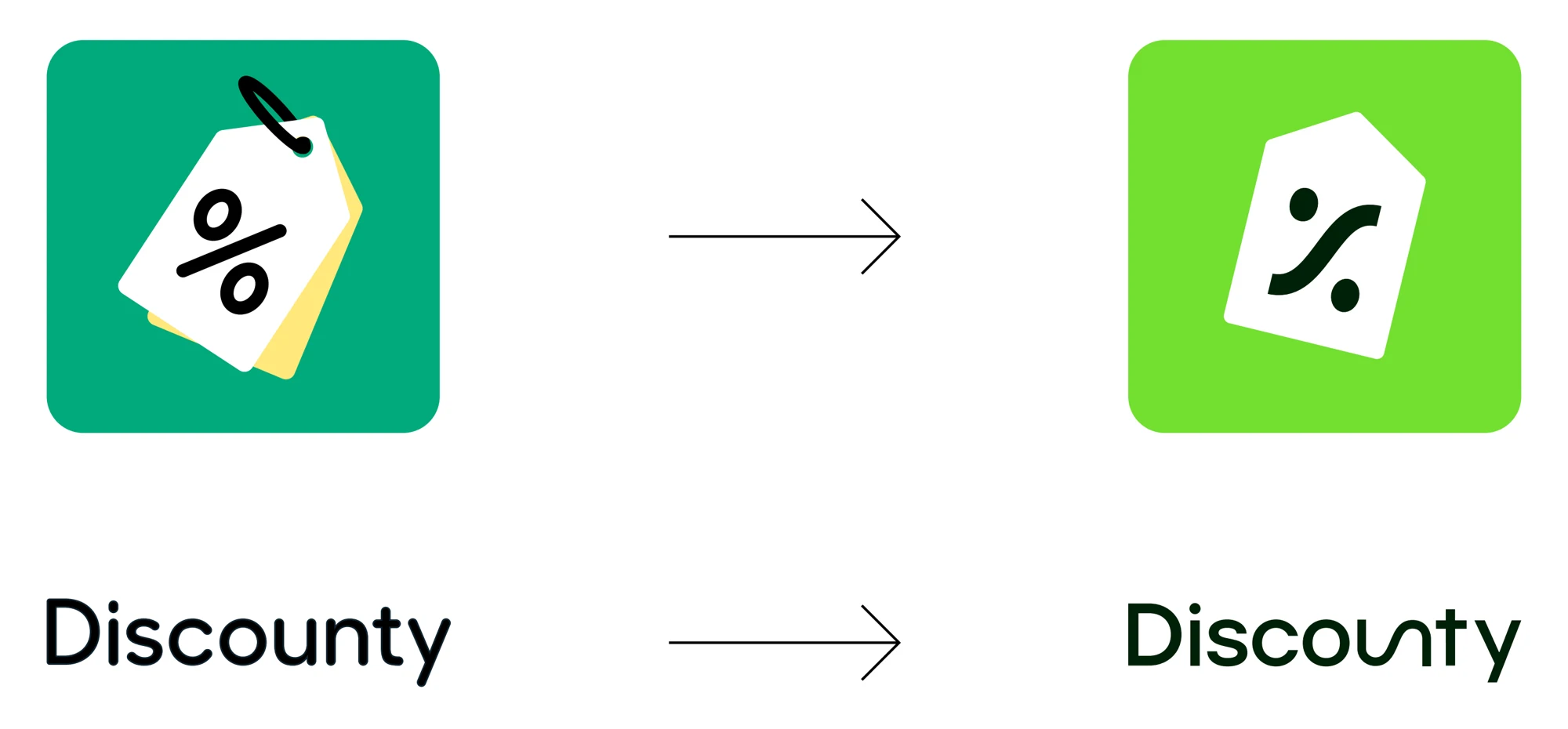
The tag, the % and the green stay. Everything else got calmer, cleaner and more exact.
Every line has a reason
Six changes, each with a job
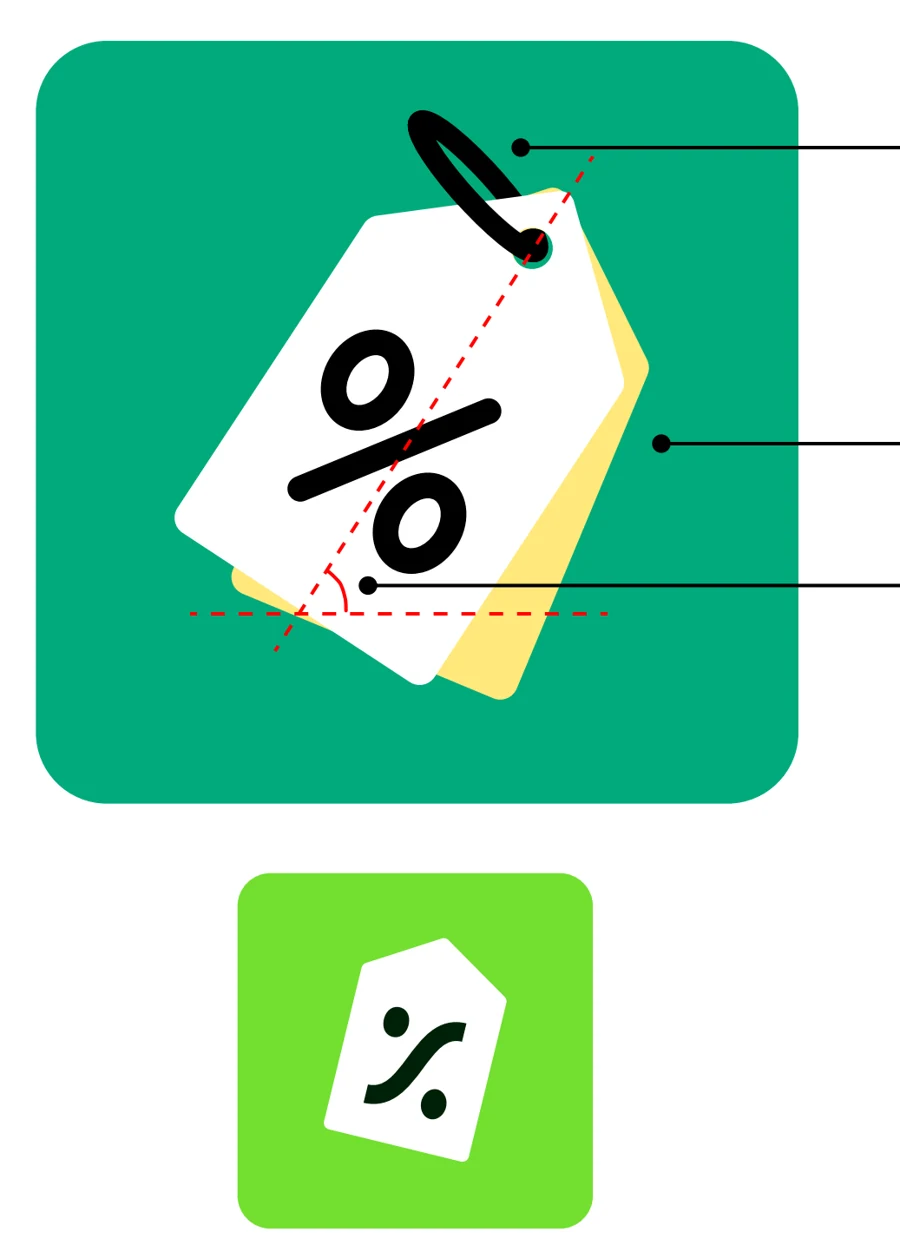
The loop is gone
The old knot was hand-drawn and uneven. A simple, even circle replaces it and still shows where a string would go.
The yellow layer is gone
It was decoration with no meaning. Anything without a reason had to go, and the mark now reads cleaner at small sizes.
A gentler angle
The steep tilt read as urgent, closer to a flash sale than a calm advisor. A softer angle keeps the energy without the rush.
An exact % mark
The circles and strokes were not evenly weighted. Now every line has the same thickness and both circles are equal.
Built from u and n
The % mark is drawn from the letters u and n, already inside "Discounty". Icon and wordmark share one formula.
A truer green
The hue stays. Saturation and lightness were tuned so dark text on the green reads clearly: 10.1 to 1, up from 5.7 before.
The system
Built from u and n
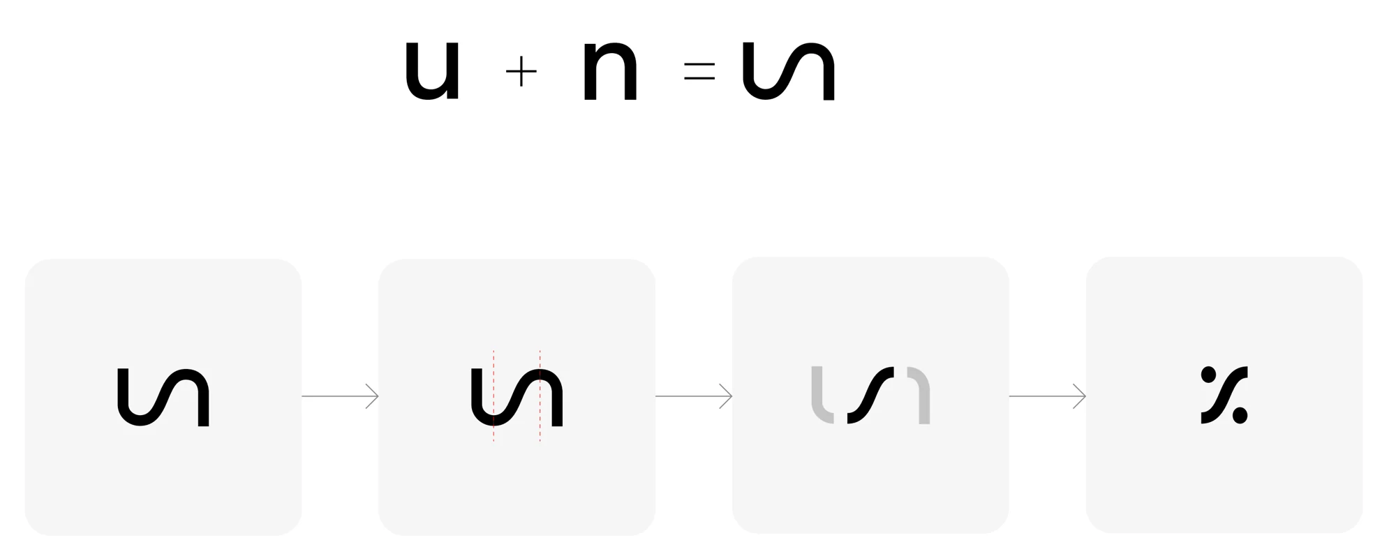
The curve of the % mark is the u and the n already inside "Discounty". The icon and the wordmark are one family, by design.
The logo
On light, on dark, on green

Colour
Three core colours, six to extend them
Forest
#002209
Sprout
#73E031
Paper
#FFFFFF
Seaweed
#073E3B
Cactus
#51715E
Pistachio
#E6F9AF
Paprika
#E53D00
Jean
#84A9C0
Bianca
#F5F6EE
Retired
The old green
#02AA7D· tuned into SproutThe yellow layer
#FFE97C· no clear meaningCoral
#FE5F55· not carried over
Dark text on the green
Contrast of the brand ink on each green. 4.5 to 1 is the accessibility bar for body text.
Type
Three typefaces, one voice
Display and headings
The trusted hand behind every sale
Accents and subheads
Count on Discounty
Body text and interface
Set the tiers, choose the products, publish.
What we stand for
The trusted hand behind every sale you run, and the goal beyond it.
Our values
Five values we hold every decision against
Earned Trust
Trust we earn and protect, not trust we claim.
We are honest about what we can and can't do, say what we'll do and by when, and stay dependable when it matters most.
Beyond the Discount
We don't stop at the discount.
A sale is a means, not the goal. We help you reach what is behind it: more revenue, bigger baskets, loyal customers, a growing store.
In Step With Commerce
As the way people buy keeps moving, we move with it.
New channels, new expectations, new ways to shop. We keep pace so you can sell wherever your customers are.
Close to You
We stay close, and a real person is always there.
Quick to hear what you need and quick to act on it, with a named person who knows your store.
Built for Every Size
Whatever your size, you can count on us.
From a first store to the largest operations. Nobody grows out of us, and nobody is left behind.
How we work with you
A calm, capable hand on your biggest day
Steady
Real times, not "shortly". Calm when it matters most.
Warm
You're a person, not a ticket. A named person signs every reply.
Straight
If we can't do something, we say so, and tell you what we can do.
Capable
Hard things made simple, without jargon.
Unassuming
We give you the facts. The decision stays yours.
Same team, same service, a new look.
Your campaigns keep running, and the same people answer when you write.
Free plan available · 3-day free trial on paid plans